-
 Branding &
Communication
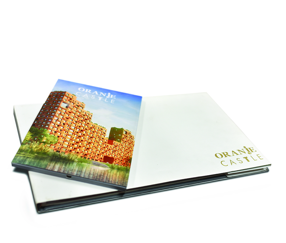
Orange Castle
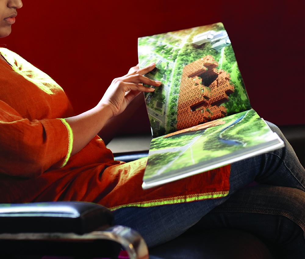
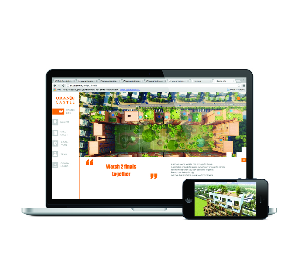
The branding of this high-profile housing complex; designed by archohm in collaboration with the Dutch firm MVRDV and Topotek, was done with a coffee table book and a video brochure.
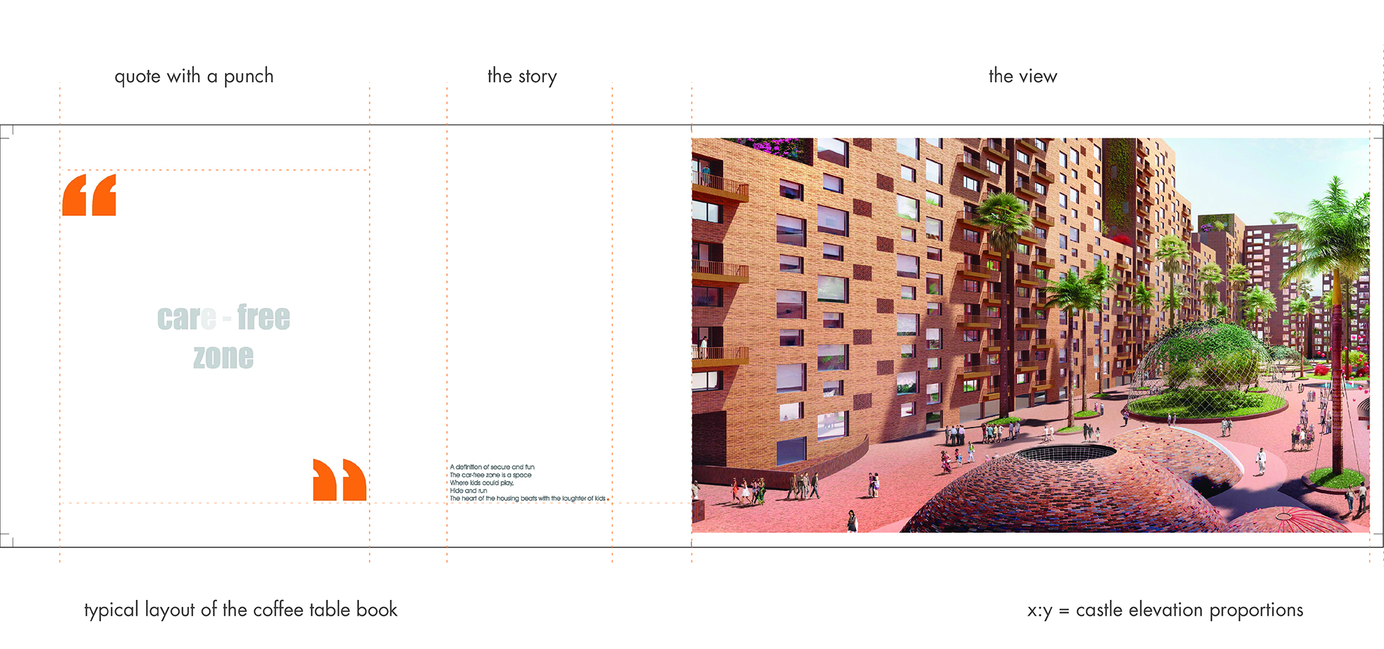
This humble third world denizen which is the unit of the exposed brickwork building also gets a chance to be the unit of the vocabulary of the language in the book. Words and even punctuations are designed on the basis of the shape and proportions of a brick. The brick tells the story of the house and pitches the complex to potential buyers!
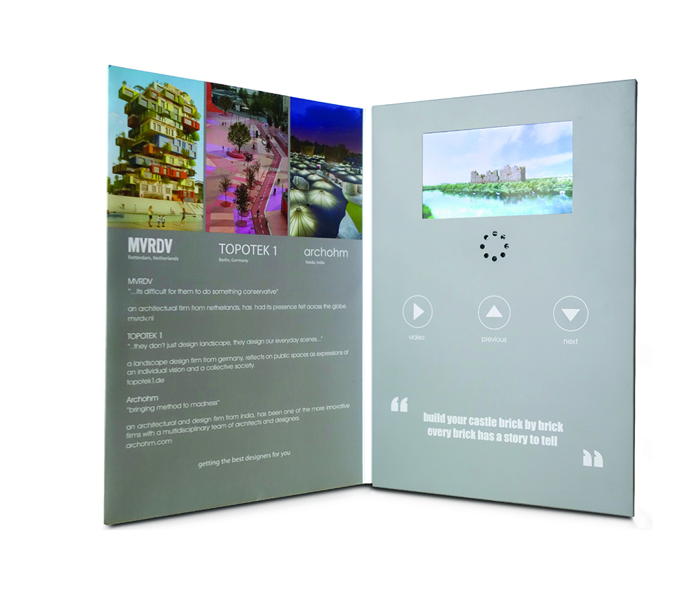
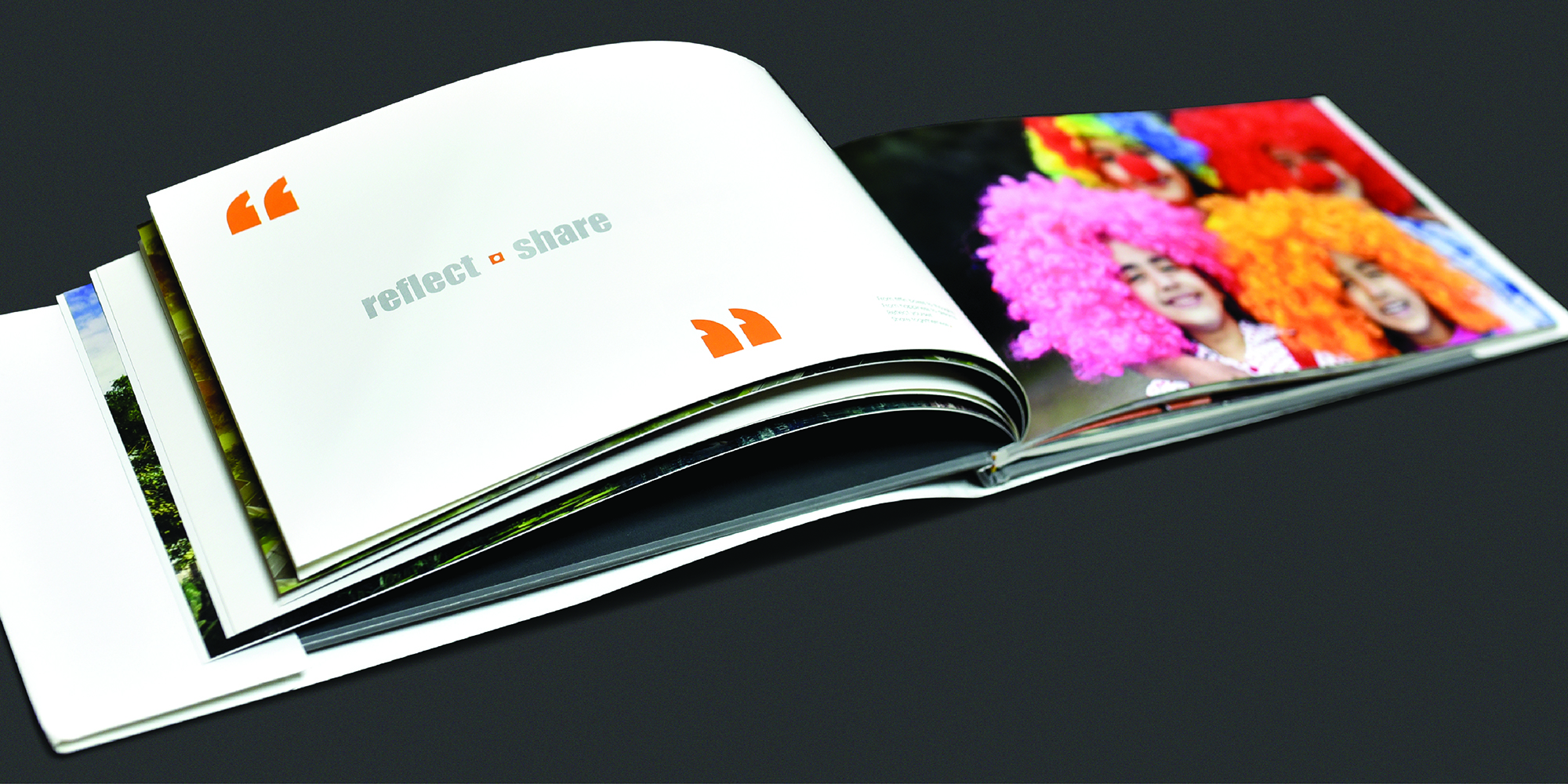
The text in the book is minimalistic. Graphics and illustrations are employed to hold the readers' attention. Punch lines are used to highlight the 'larger than life' elements such as the grand entrances, the massive bird enclosures and many such.
The key features of a housing complex, the parameters that people actually dream of while investing in a home, are thus communicated in a fun, innovative yet effective way. The presentation of the book is reflective of the design of spaces as well.
'Even a brick wants to be something.' - Louis I.Kahn